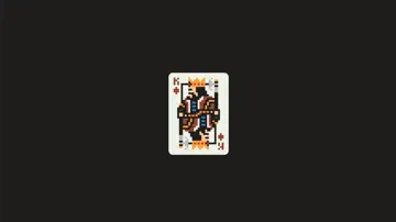
One-Div-8Bit Playing Card
Bit-style playing card drawn in pure CSS! Only 1 div, only 1 squared shape, using box-shadow hack.
Made with: HTML (Pug),CSS (SCSS)
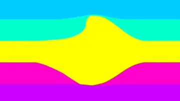
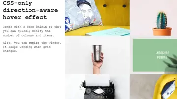
Css-Only Direction-Aware Hover Effect
CSS-only direction-aware hover effect is actually less tricky than you might think.
Made with: HTML,CSS (SCSS)
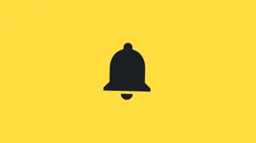
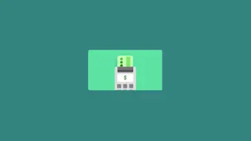
Notification Bell Icon Layered Shake Animation Effect
Animated Google Material Design icon. Three layers. CSS rotate transform and opacity animation effects.
Made with: HTML,CSS
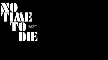
No Time To Die Title Sequence
Title lock up animation for the new Bond film, "No Time To Die". Hand rolled SVGs animated with GSAP. Each row has a separate time counter to make sequencing more simple to handle. Every part of each letter has it's own to make transform calculations easier also, as all transformations are from the root. This means no need to calculate scale or rotation offsets. Makes the markup more complex, but the animation easier. Complexity has to go somewhere...
Made with: HTML,CSS (SCSS),JS
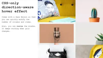
Css-Only Direction-Aware Hover Effect
Comes with a Sass @mixin so that you can quickly modify the number of columns and items. Also, you can resize the window. It keeps working when grid changes.
Made with: HTML,CSS (SCSS)
Object-Oriented Javascript - Second Edition
As applications move from the desktop to the browser, the need to learn well-structured JavaScript is vital. This book is for developers who want to learn JavaScript from scratch, or take their JavaScript skills to a new level of sophistication. A completely free and full-length introduction to objects in JavaScript, it teaches through examples and practical play.
Made with: 2013
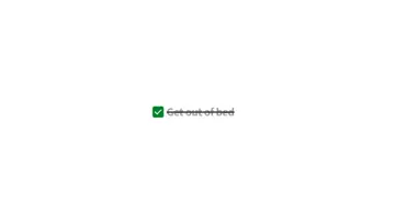
Todo Checkbox
Todo checkbox with a text fill hover and strikethrough effect when checked.
Made with: HTML,CSS (SCSS)

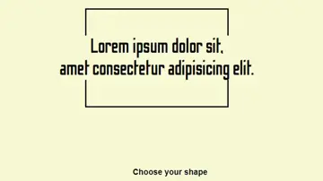
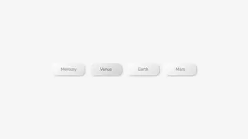
Neumorphic Tabs
Tabbed content with JavaScript; Neumorphic styling; Dark mode; Remembers previous state on reload (with localStorage); Matches OS colour scheme (with prefers-color-scheme).
Made with: HTML,CSS,JS
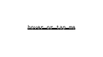
Underline Clip Hover Animation
A fancy animated underline using text clipping. The text uses background-clip: text and a linear-gradient background to be bi-color. We get around animating the gradient by animating the background-position instead. We have to use a wrapper element for having the underline highlight under the text, since the text color is already the background!
Made with: HTML,CSS