
A Clean Responsive Web Design Menu Tutorial With Css, Html And Jquery
"In this article, we’ll break down Brolik’s new responsive web design menu and explain how the code works line by line."
Made with: HTML
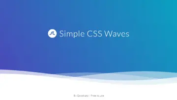
Simple Css Waves
Lightweight animation between header & content. Easy to customize and apply to any website! Works with all devices and screen sizes.
Made with: HTML,CSS
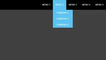
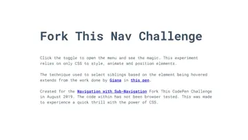
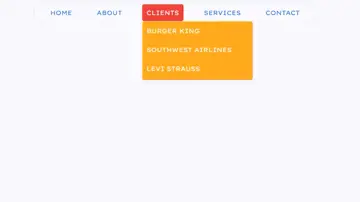
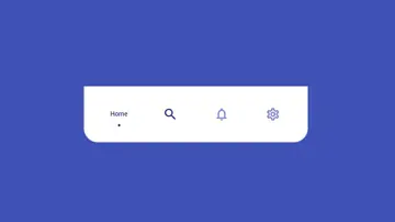
Css Navigation
Click the toggle to open the menu and see the magic. This experiment relies on the only CSS to style, animate and position elements.
Made with: HTML,CSS (SCSS)
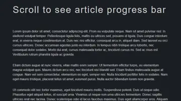
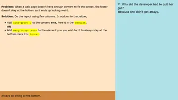
Footer Always At The Bottom - Flexbox
When a web page doesn't have enough content to fit the screen, the footer doesn't stay at the bottom so it ends up looking weird. Solution: Do the layout using flex columns. In addtion to that either, add flex-grow: 1 to the content area, here it is the section. Or add margin-top: auto to the element you you wish for it to always stay at the bottom, here it is footer.
Made with: HTML,CSS
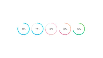

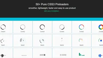
50+ Pure Css3 Preloaders
Smoother, lightweight, faster and easy to use product.
Made with: HTML,CSS