
_1837.webp)
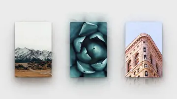
Multiple Shadows
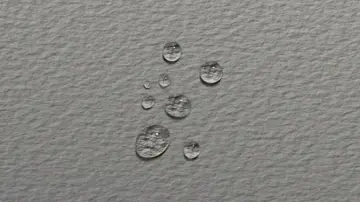
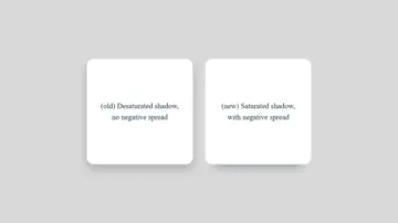
Playing with placing multiple shadows on an element. This gives it the look of depth with a "natural" shadow, as if there was actually a light shining on the page.
Made with: HTML,CSS (SCSS)

Css Pixel Animation
8 bit pixelated woman made with box-shadows on a single div.
Made with: HTML,CSS (SCSS)
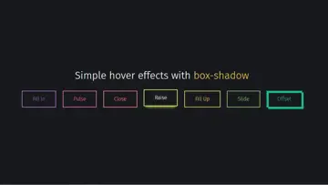
Button Hover Effects With Box-Shadow
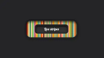
Making some basic animations with box-shadows. No extra elements or even pseudo elements required. Tips: - We're setting all the blurs to 0 since we want a solid fill; - Add the inset keyword so the box-shadow is on the inside of the element; - Animating the inset shadow on hover looks like the element is filling in from whatever side you specify ([top] and [left] accept negative values to become [bottom] and [right]); - Multiple shadows can be stacked; - If you're animating multiple shadows, be sure to keep the same number of shadows so the animation is smooth. Otherwise, you'll get something choppy.
Made with: HTML,CSS (SCSS)
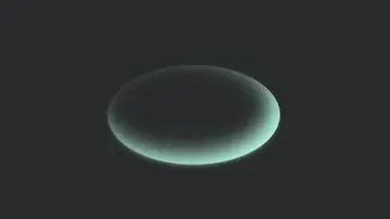
Box-Shadow Spill
Using offsetting inset and outer box-shadows to create a 3D-like effect.
Made with: HTML (Pug),CSS (SCSS)
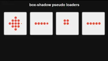
Box-Shadow Pseudo Loaders
Leveraging the use of box-shadow to create interesting loading effects with just pseudo elements. Just by adding a class to an element you can get a cool loading animation in an overlay.
Made with: HTML (Pug),CSS (Stylus)

Isolating Css Box Shadows
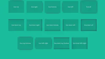
A simple & often misunderstood CSS fundamental. To isolate a single shadow we apply a negative spread and offset in the desired direction, then add a blur radius of equal distance to compensate. For inset shadows, the spread remains constant but we apply an offset in the opposite(-ve) direction. For multiple sides/shadows, simply combine any of the desired single-side rules into a comma separated list.
Made with: HTML,CSS (SCSS)
