

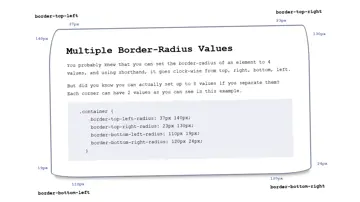
Multiple Border-Radius Values
You probably knew that you can set the border-radius of an element to 4 values, and using shorthand, it goes clock-wise from top, right, bottom, left. But did you know you can actually set up to 8 values if you separate them? Each corner can have 2 values as you can see in this example.
Made with: HTML,CSS
Css Candy Stripe Border Using Clip-Path
Create a responsive candy stripe border using the clip-path property on each of the list items in a ul. Change the height, background color, and stripe color very easily.
Made with: HTML (Pug),CSS (Sass)


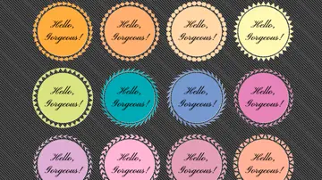
Pure Css Circular Border Patterns
The border patterns are created with clip-path on a pseudo-element.
Made with: HTML (Pug),CSS (SCSS)
Map-Inspired Border
Map-inspired border effect using stacked border & box-shadows. Single HTML element with CSS.
Made with: HTML,CSS (SCSS)
Magic Borders
Try to have a dynamic and responsive table that has borders only between cells.
Made with: HTML,CSS (SCSS)
Interactive Button Border
Button with an interactive border gradient.
Made with: HTML,CSS (SCSS),JavaScript (Babel)

Gradient Border
HTML and CSS gradient border without pseudo elements.
Made with: HTML,CSS (SCSS)



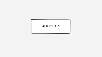
Sketchy Border
Using 8 border-radius values can be pretty dope. This example shows how using it on the element and its ::before pseudo element can create a sketchy look and feel.
Made with: HTML,CSS (SCSS)
Css Gradient Clip-Path Borders
This example shows how the CSS clip-path property can be used to create a variety of shaped gradient borders.
Made with: HTML,CSS
