City of Grace

City of Grace
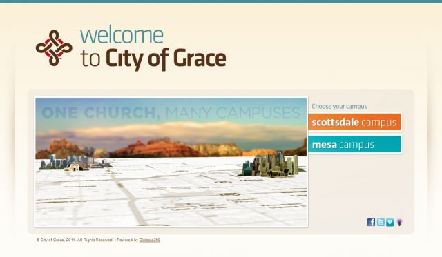
Description: City of Grace is committed to sharing the hope of the gospel in the most clear and concise way possible. Our website is an integral part of that commitment. The idea behind our recent redesign was to SIMPLIFY. Our hope is that any first time visitor can find the information they need in 3 or 4 clicks, without reading their way through a maze of well-intentioned text. By keeping the style simple, and the text to a minimum, we have achieved a better user experience. It's amazing what a simple graphic can say and 100 words cannot express. Historically, the City of Grace website design has been outsourced to design agencies. This time around, we completed all design and implementation in-house. We are blessed with a team that not only has ownership in the vision of the church, but also the talent and skill necessary to take on a website redesign. The result is a more accurate representation of who we are as a church. Each member of our design team takes personal ownership in the vision of City of Grace. That simple fact solidifies the team as an invaluable asset.
Keywords: css clean good use of color effective church website impressive design concise
Posted: 18.03.2011