lgfcu partners

lgfcu partners
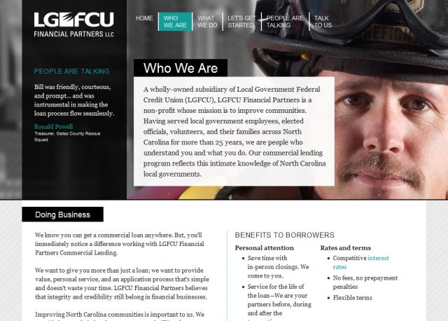
Description: The site is meant to be a "one stop shop" for clients interested in commercial lending. The Financial Partners wanted strong imagery with content that emphasized their personal service. Among other CSS3 techniques, the interior pages use media queries to change the content's width depending on the user's browser window size while the background photography and texture span larger for wider monitors. On the "People Are Talking" page I used Adobe Spry to create collapsible panels for each quote topic to accommodate the large amount of text. The user can view as many or as few testimonials as they wish.
Keywords: css financial lending commercial loans
Posted: 24.08.2010