TravisNeilson.com

TravisNeilson.com
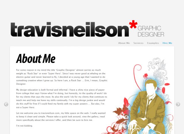
Description: The site uses clean and clear typographical hierarchy. The page structure is logical as it moves literally and logically from an introduction to a list of skillsets, then to work examples and finnaly on to a call to action. Also, the copy writing as met with great acclaim.
Keywords: Designer mininal portfolio Graphic Design
Posted: 29.07.2008